The Problem
Rio Tinto's Kennecott copper mine in Utah operates a concentrator facility where raw ore is processed to extract copper. The concentrator is a complex system of circuits and rows, each containing dozens of instrumented components: frother flow, collector setpoints, froth depth, air setpoints, pH levels, and more. The percentage of copper recovered from the ore depends on how well these components are tuned and maintained across each shift.
At the time this project began, shift planners estimated recovery percentages before each shift based on their own experience and a small set of upstream variables like ore type and grind size. Rio Tinto's PACE Analytics unit had built a predictive model that weighed hundreds of variables to generate more accurate recovery predictions. The model was more accurate than human estimates. But it hadn't been adopted. The planners and shift supervisors who needed the predictions had no way to access them in their day-to-day workflow.
This was a classic gap between what a data science team builds and what operational users can actually use. The model existed. The interface didn't. And without the interface, the model's value was theoretical.
What Existed Before
Before we began designing the application, the only way shift supervisors and planners could view the concentrator's real-time performance was through a live Excel spreadsheet. The spreadsheet displayed row-level recovery predictions, shift plan targets, and variance calculations across a set of tabs. It was not intuitive or easy to parse at a glance, and it did not provide actionable information that operators could use to adjust the ore recovery process in real time.
The predictive model itself produced a feature importance chart showing which of hundreds of variables were driving recovery predictions up or down. This was valuable to the data science team, but it was unintelligible to the shift supervisors and planners who needed to act on the information.


How We Worked
Rio Tinto's PACE Analytics team engaged me and a collaborator to close that gap in three weeks. The engagement ran from late November through late December 2019, structured as a compressed discovery-and-design sprint with four phases: project kickoff and discovery, two sprint weeks onsite, and a deliverables documentation phase.
I traveled to the mine site at Kennecott to conduct the research directly. During the first week, I conducted stakeholder and subject matter expert interviews with Rio Tinto representatives both remotely (Brisbane-based staff) and in-person at the Kennecott corporate office. Then I went to the concentrator facility itself to interview and observe the primary users: shift supervisors and shift planners/schedulers.
The onsite sessions were participatory. I didn't just interview people about their work. I worked alongside them and the analytics data science team to brainstorm workflows, requirements, and design concepts in real time. The artifacts generated during these sessions included stakeholder goals and target user needs, design principles and high-level workflows, target user personas and user stories, and low-fidelity sketched workflows and wireframes.
During the second week, I created higher-fidelity wireframe and workflow representations and then brought them back to the mine for follow-up validation sessions with stakeholders, subject matter experts, shift supervisors, and planners. These sessions tested where the designs met user needs and where they didn't, and surfaced latent requirements that hadn't emerged during the first round. After each session, I iterated the workflows and wireframes based on what I'd learned.
The design process was deliberately rapid and iterative. Concepts progressed from hand-sketched whiteboard work in the first stakeholder session, to annotated wireframes after the first supervisor and planner sessions, to mid-fidelity mobile wireframes validated in the second round, to a final annotated wireframe set with desktop variants.

What We Found
Two Personas, Two Time Horizons
The discovery research identified two primary personas with distinct but complementary needs.
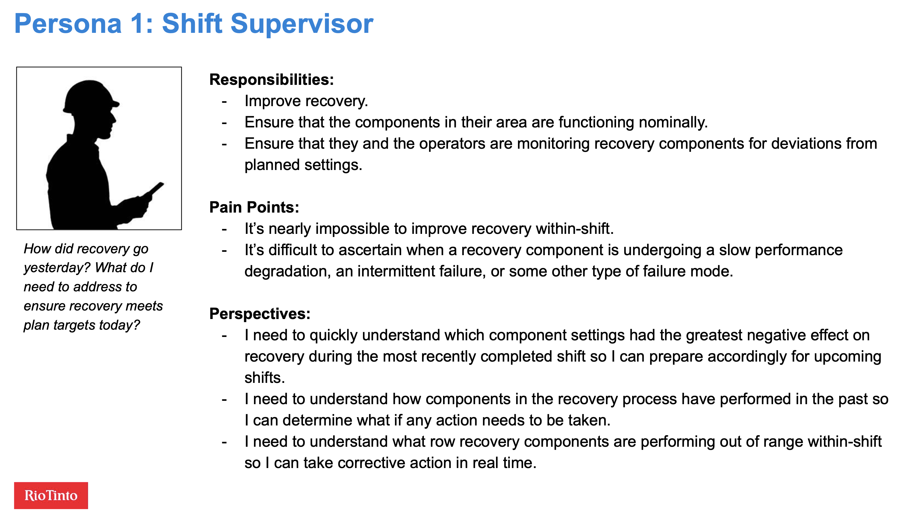
Shift supervisors are responsible for improving recovery within their area during each shift. They're walking the floor, monitoring equipment, and troubleshooting when components drift out of spec. Their core questions are tactical and time-sensitive: What affected recovery during last shift? What's affecting recovery right now? Which components are functioning nominally and which need attention?
Their pain points were specific: it was nearly impossible to improve recovery within a shift because they lacked real-time visibility into component performance, and it was difficult to tell whether a component was undergoing slow degradation, intermittent failure, or something else entirely.
Planners and schedulers operate on a different time horizon. Their job is to create shift plans that yield the best possible recovery given the upstream inputs. They possess deep expert knowledge of the recovery process, but the upstream information they rely on isn't always accurate. They need to understand the relationship between planned and actual recovery at a granular level so they can make better plans. Their aspirational need was the ability to run "what if" scenarios using historical upstream data and actual recovery data.

Design Principles
Based on the discovery work, I generated five design principles that framed the V1 scope and future roadmap:
- Provide value to target users through minimum viable data visualizations for row recovery components
- Make it mobile-friendly since supervisors need data while walking the operations floor
- Support improved recovery planning
- Leverage both extrinsic and intrinsic motivation among operators and supervisors
The mobile-first requirement was critical. Shift supervisors need to access performance data on their phones while walking the concentrator floor. Planners and schedulers work at desktops for deeper analysis. The application needed to serve both contexts.
What We Designed
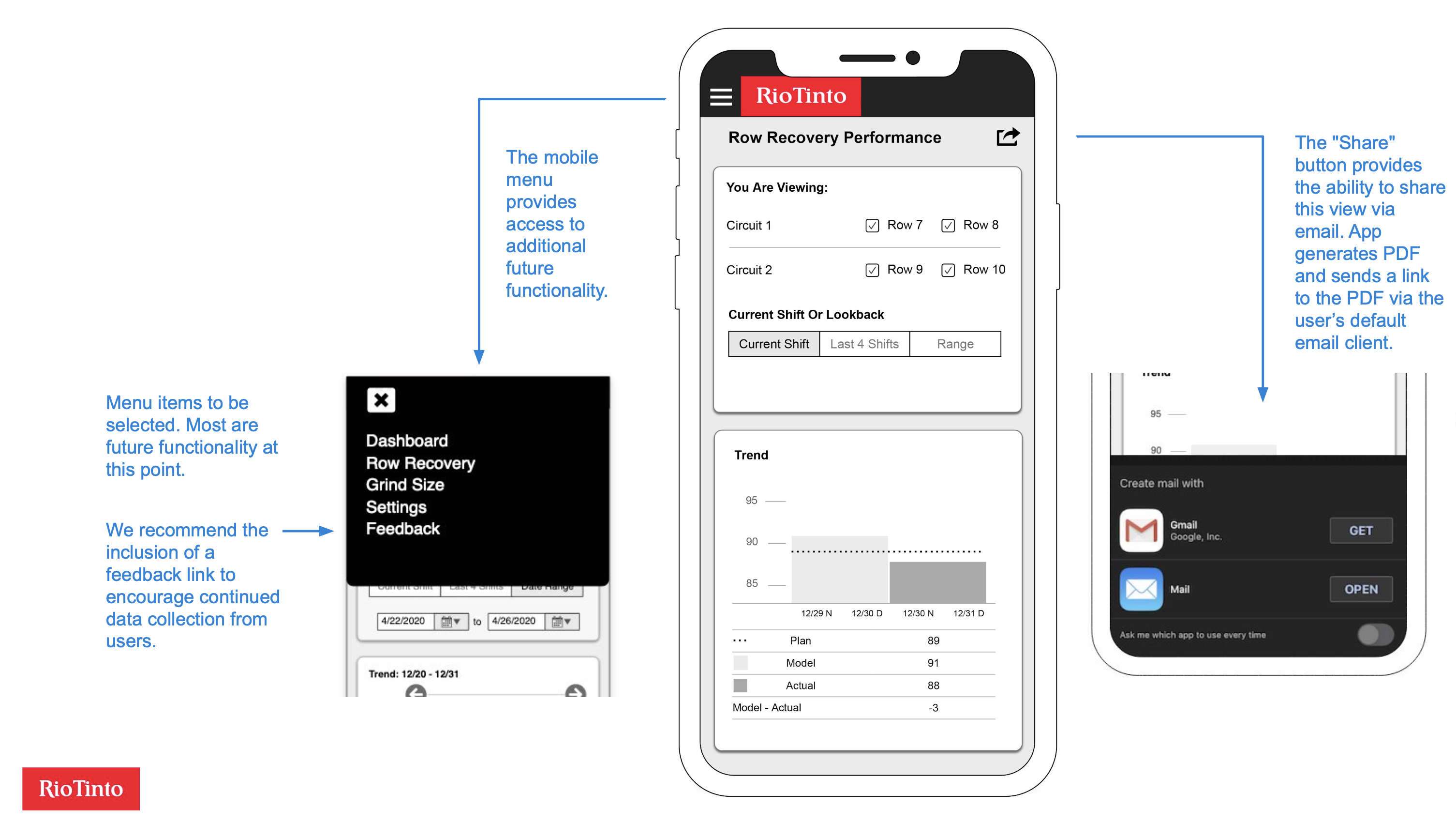
The wireframes I produced covered mobile and desktop viewports with three core views.
The performance overview showed the current shift's row recovery data, comparing planned, model-predicted, and actual recovery percentages across circuits and rows. Users could toggle between three time frames: current shift, last four shifts, and a custom date range. Below the trend chart, a "Top 5 Settings Deviations" visualization showed which component settings had deviated most from their targets, immediately surfacing the factors most likely to be dragging down recovery.
The settings detail view let users tap on any deviation bar to drill into that component's historical performance. A horizontal bar chart showed the component's deviation from setpoint across multiple shifts, with a red threshold line making it easy to spot when deviations crossed from normal into concerning territory. Users could select date ranges and sort order.
The desktop viewport reorganized the same data into a wider layout with a persistent left-side navigation. The larger screen allowed more historical data to be visible at once, which served the planners' need for longer-term pattern recognition.

I also recommended the inclusion of a feedback mechanism in the mobile menu to encourage continued data collection from users post-launch, and a share-via-email feature so supervisors could quickly send a performance snapshot to a colleague.
Outcomes
Using rapid discovery, facilitation, and design techniques, I designed and validated a predictive analytics application for workers at one of the world's largest copper mines. This enabled Rio Tinto to begin improving ore recovery rates.
What I Learned
This project reinforced something I've seen consistently across domains: the hardest part of deploying a predictive model isn't building the model. It's designing the interface that lets the people who need the predictions actually use them in their workflow. The analytics team had built a model that was demonstrably more accurate than human estimates. But accuracy doesn't matter if the predictions sit in a data science notebook that shift supervisors never open.
The onsite research was essential for this. You cannot design an effective industrial monitoring application from a conference room. The shift supervisors' workflow is physical: they walk the concentrator floor, they check equipment, they make decisions in real time based on what they see and hear. Designing a mobile app that fits into that workflow required watching them do it, understanding the rhythm of their shifts, and building the information hierarchy around their actual decision sequence rather than around the data science team's model architecture.
The compressed timeline was a feature, not a constraint. Three weeks of rapid iteration with real users produced a more grounded design than months of remote specification work would have. Each of the four onsite sessions brought the design closer to something that fit the operational reality. The hand-sketched whiteboard concepts from session one looked nothing like the validated wireframes from session four, and that's exactly the point.